H2O
The taste of nature in a bottle
About The Design Process
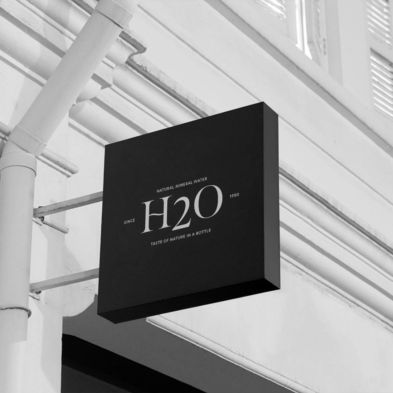
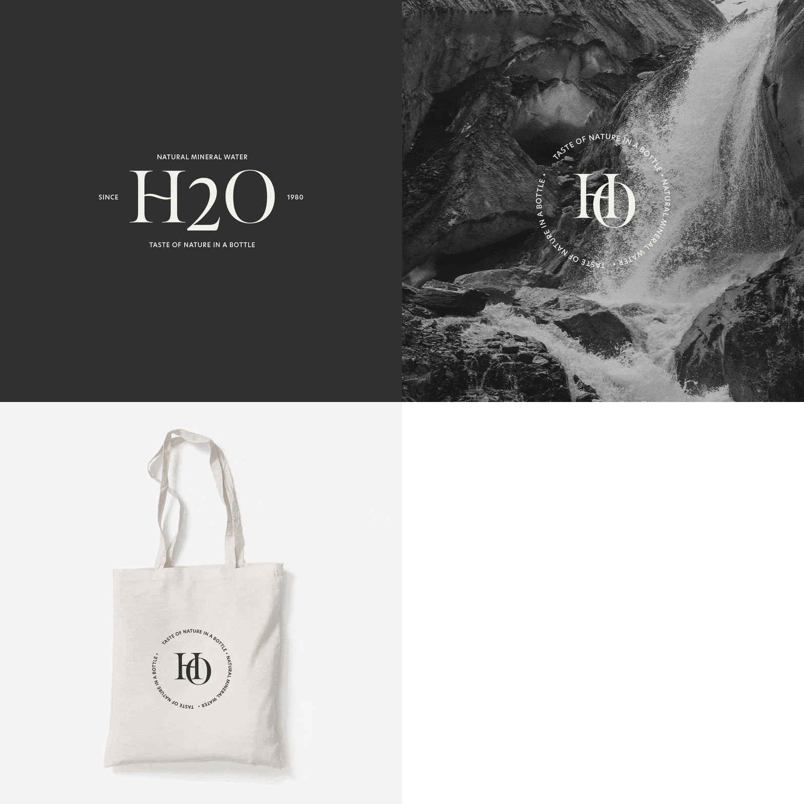
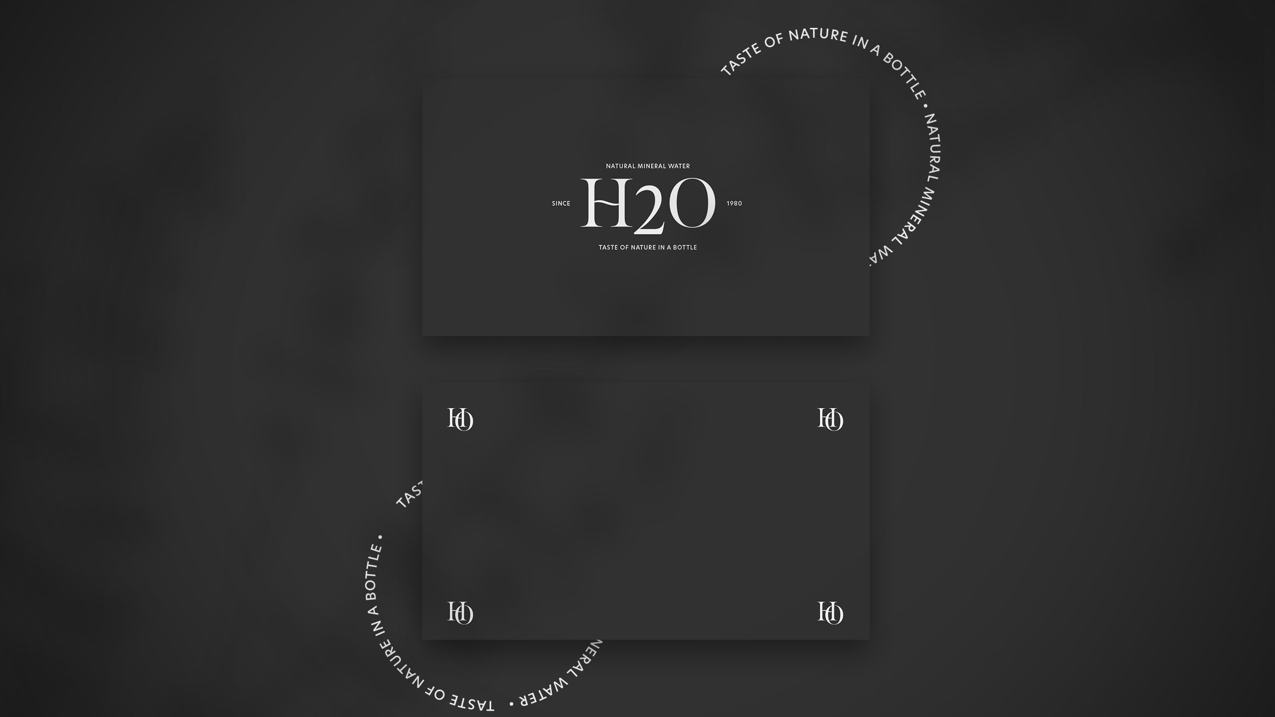
The logo simply consists of H2O while creating a custom type for the letter H which represents the flow of water. They wanted their branding to stay minimal, simple, and clean. Hence why I decided to create a minimal and modern design for the brand H2O.
Hi there, I am Monica! I am a graphic designer. I flourish when being creative and I have found my passion through this. I now run my own design business with the sole purpose of helping ambitious brands realize their dream. As a kid, I dreamed of doing what I really love. At first I found nursing attractive, but I soon realized that my passion lay in graphic design.


Results of H2O
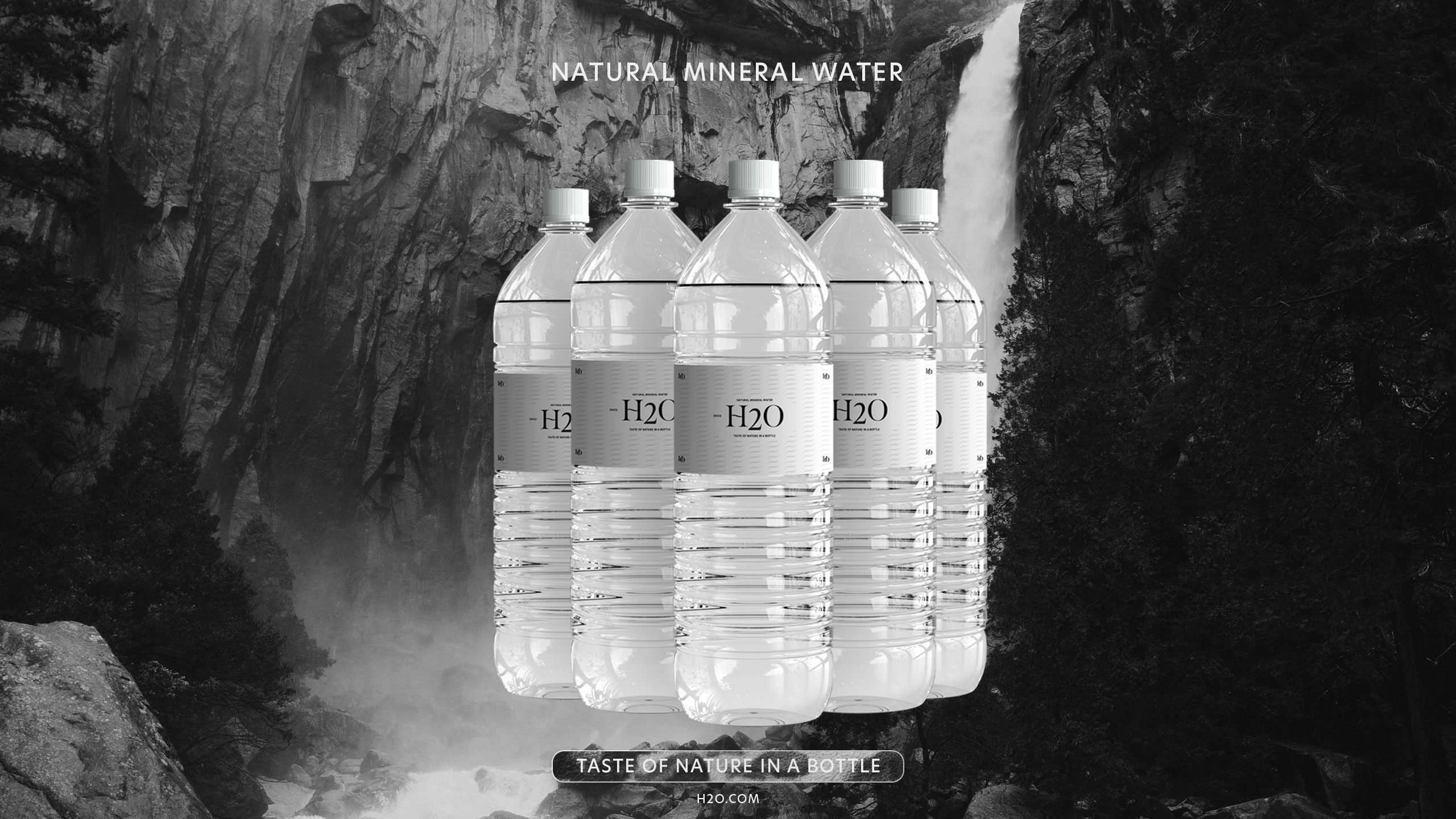
H2O is the chemical formula of water, meaning that each of its molecules contains one oxygen and two hydrogen atoms, when creating this brand I decided to take a minimalistic approach towards the brand. Their goal is to give people the taste of nature in a bottle.
The logo simply consists of H2O while creating a custom type for the letter H which represents the flow of water. They wanted their branding to stay minimal, simple, and clean. Hence why I decided to create a minimal and modern design for the brand H2O.
